Introduction to Responsive Design
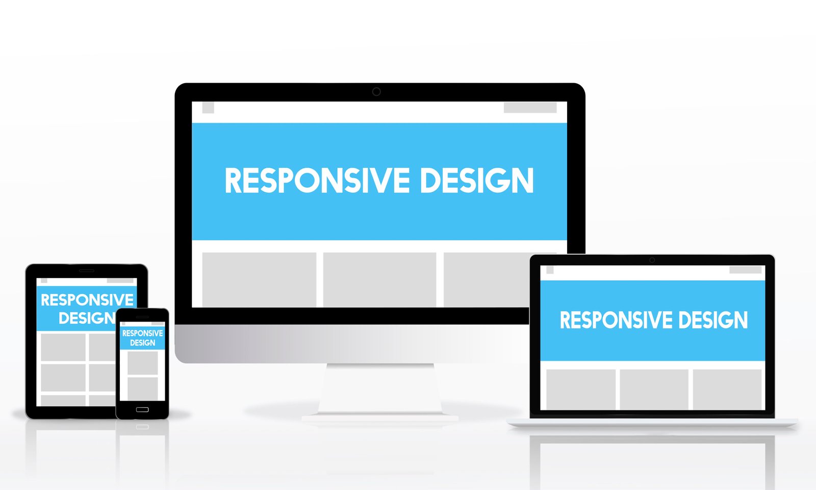
Responsive design is a pivotal concept in modern web development, referring to the approach of creating web pages that automatically adjust and scale their layout to fit various screen sizes and devices. This encompasses desktops, tablets, and smartphones, ensuring a consistent user experience regardless of the device used. The core principles of responsive design include fluid grids, flexible images, and media queries.
The history of web design has seen a significant evolution, transitioning from static layouts to more dynamic, adaptable frameworks. Initially, websites were designed with fixed dimensions, primarily tailored for desktop monitors. However, as mobile devices and tablets surged in popularity, the need for more flexible designs became apparent. This gave rise to responsive design, which was first coined by Ethan Marcotte in 2010. Marcotte’s vision laid the foundation for what has now become a standard practice in web development.
At its core, responsive design is about creating a seamless and efficient user experience. Fluid grids play a crucial role, allowing layout elements to resize proportionally according to the screen size. Flexible images, which adjust within their containing elements, prevent overflow issues and ensure visuals remain sharp and relevant. Media queries enable designers to apply different styles based on the characteristics of the device, such as screen width, height, and resolution.
The importance of responsive design in digital marketing cannot be overstated. As consumers increasingly access content through a variety of devices, businesses must ensure their websites and digital assets are easily navigable and visually appealing across all platforms. A responsive website not only enhances user satisfaction but also improves search engine rankings, as search engines like Google prioritize mobile-friendly sites in their algorithms. Ultimately, responsive design is essential for reaching and engaging a broader audience in today’s diverse digital landscape.
The Role of Responsive Design in User Experience (UX)
In the realm of digital marketing, the significance of responsive design cannot be overstated. At its core, responsive design is about creating a seamless and adaptive interface that enhances user experience (UX) across various devices and screen sizes. By ensuring that a website is accessible and functional on smartphones, tablets, and desktops, organizations can significantly improve navigation, readability, and overall user engagement.
A well-executed responsive design plays a crucial role in simplifying navigation. Users can effortlessly explore content without facing layout disruptions or cumbersome scrolling. For instance, when a website’s menu adapts to a mobile-friendly format, users can easily find what they are looking for, reducing frustration and enhancing satisfaction. Additionally, readability is greatly improved; fonts and images scale appropriately, ensuring that content is legible without the need for excessive zooming or horizontal scrolling.
Case studies provide tangible evidence of the impact of responsive design on user experience. One notable example is that of a major e-commerce retailer that revamped its website with a focus on responsive design. Post-redesign, the retailer observed a 20% increase in mobile traffic and a 15% rise in overall conversion rates. The improved UX led to longer session durations and reduced bounce rates, indicating heightened user satisfaction and retention.
Moreover, the correlation between good UX and increased conversion rates is undeniable. A user-centric approach that prioritizes responsive design can lead to significant business benefits. When users encounter a website that is intuitive and easy to navigate, they are more likely to complete desired actions, such as making a purchase or filling out a contact form. This, in turn, boosts conversion rates and fosters customer loyalty.
In summary, incorporating responsive design into digital marketing strategies is imperative for achieving optimal user experience. By enhancing navigation, readability, and engagement, responsive design not only satisfies users but also drives higher conversion rates, underscoring its vital role in today’s digital landscape.
SEO Benefits of Responsive Design
Responsive design plays a pivotal role in enhancing search engine optimization (SEO) by ensuring that websites are mobile-friendly and adaptable to various screen sizes. Search engines, particularly Google, have incorporated mobile-friendliness into their ranking algorithms, meaning that websites optimized for mobile devices tend to rank higher in search results. This prioritization is rooted in the growing number of users accessing the internet via smartphones and tablets, making a seamless mobile experience essential for retaining and attracting visitors.
One of the significant advantages of responsive design is its ability to reduce bounce rates. When users encounter a website that is difficult to navigate on their mobile devices, they are more likely to leave the site quickly, leading to higher bounce rates. A responsive design ensures that the website’s layout, images, and text adjust fluidly to different screen sizes, providing a consistent and user-friendly experience across all devices. This improved user experience encourages visitors to stay longer and engage more with the content, which positively impacts SEO rankings.
Additionally, responsive design contributes to faster page load times, which is a critical factor in both user satisfaction and search engine rankings. Search engines favor websites that load quickly because they provide a better user experience. A responsive design eliminates the need for separate mobile and desktop versions of a site, streamlining the code and reducing the load on servers, which in turn speeds up page loading times.
The performance metrics of a website, such as average session duration, pages per session, and conversion rates, are also enhanced by responsive design. These metrics are closely monitored by search engines and can influence a website’s ranking. Non-responsive designs can lead to poor user experiences, negatively affecting these metrics and causing a decline in search rankings over time.
In conclusion, the long-term benefits of adopting a responsive design approach are substantial. Not only does it cater to the growing mobile user base, but it also aligns with the criteria set by search engines for higher rankings. By reducing bounce rates, improving page load times, and enhancing overall site performance metrics, responsive design is an indispensable element in achieving effective SEO.
Implementing Responsive Design in Your Digital Marketing Strategy
Incorporating responsive design into your digital marketing strategy is crucial for delivering a seamless user experience across various devices. Here is a step-by-step guide to help marketers and web developers achieve this:
1. Embrace Mobile-First Design: Start by designing for the smallest screen first, then gradually enhance the design for larger screens. This approach ensures that the most critical elements are prioritized and user-friendly on mobile devices.
2. Utilize CSS Frameworks: CSS frameworks such as Bootstrap and Foundation are instrumental in creating responsive designs. These frameworks offer pre-built components and a grid system that can adapt to different screen sizes, saving development time and ensuring consistency.
3. Implement Fluid Grids and Flexible Images: Fluid grids allow your layout to resize proportionally based on the screen size. Use percentages instead of fixed units like pixels. Similarly, ensure that your images are flexible by setting their maximum width to 100%, enabling them to shrink within their containers.
4. Use Media Queries: Media queries enable you to apply specific CSS rules based on the device’s characteristics, such as screen width, height, and orientation. This allows for fine-tuning the design to ensure optimal display across various devices.
5. Prioritize Speed and Performance: A responsive website must load quickly on all devices. Optimize images, leverage browser caching, and minimize HTTP requests to enhance performance. Tools like Google PageSpeed Insights can help identify areas for improvement.
6. Conduct Responsive Design Testing: Testing is vital to ensure your design works seamlessly across all devices. Tools like BrowserStack and Responsinator allow you to test your design on multiple devices and browsers, identifying any issues that need addressing.
7. Regular Maintenance and Updates: The digital landscape is constantly evolving, with new devices and browsers emerging regularly. Ongoing maintenance and testing are essential to ensure your responsive design remains effective. Regularly update your CSS frameworks and test your website to address any compatibility issues.
By following these steps and leveraging the appropriate tools and technologies, you can integrate responsive design into your digital marketing strategy effectively, ensuring a positive user experience that supports your marketing goals.